
LUMO SKIN
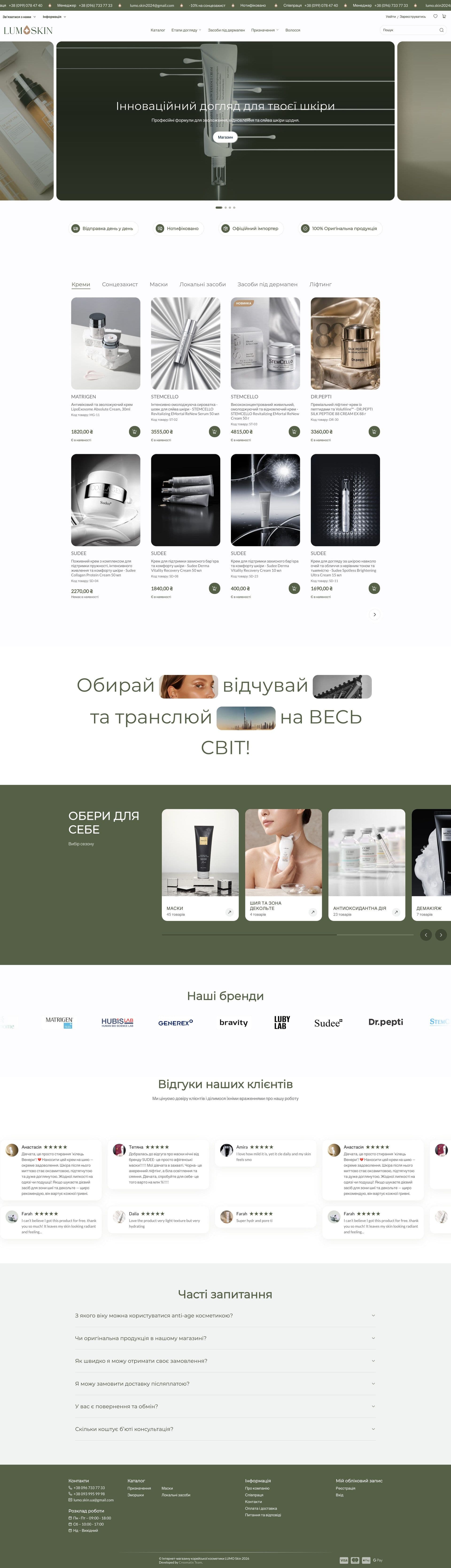
LUMO SKIN is an online store for Korean cosmeceuticals based in Kyiv. The team is the official importer and exclusive representative in Ukraine for several professional facial skincare brands. They came to Creomatix with a simple but not easy task: the old site no longer matched the quality of the products, and they needed a store where complex skincare is easy to understand, choose and buy without a manager’s help.
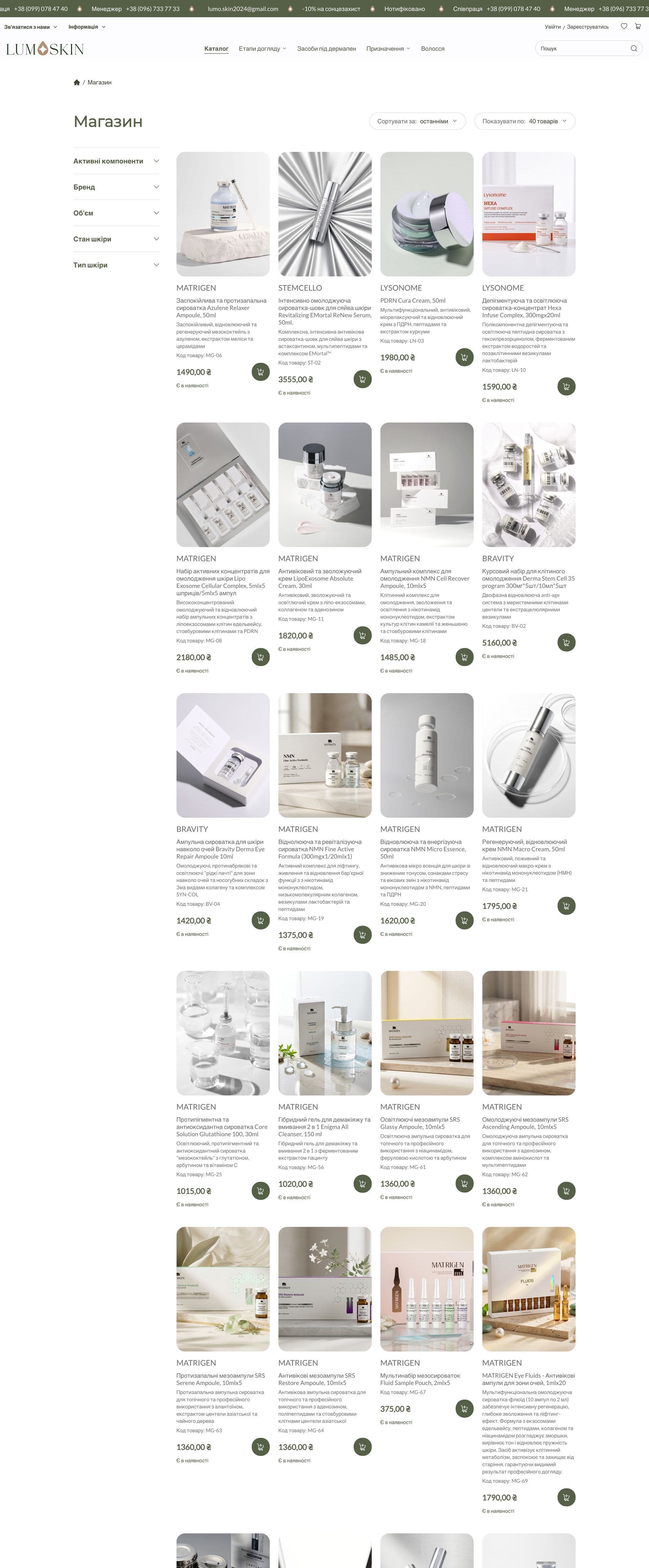
What was done?
We began by talking about the customer. People rarely arrive knowing the name of a cream: they know they want to fade pigmentation or restore their skin after a procedure. So we built the catalog around two paths: by care step (from makeup removal and cleansing to serums, creams, SPF and masks) and by purpose (regeneration, pigmentation, wrinkles, enlarged pores, redness and more). A shopper can reach the right product either way.
The design is built on calm and cleanliness: a muted green palette, plenty of white space, large product photos and as little visual noise as possible. A product card shows the brand, name, code, price and availability at once, so there is no need to open every item. New arrivals and promotions are marked separately, and the home page talks about the store the way good skincare feels: quietly and without shouting.
Then we went through the whole shopping journey, from the first visit to payment: a wishlist for items to come back to, a slide-out cart, a personal account with orders, and separate “Delivery and payment” and “Partnership” pages for business partners. Everything is responsive, because most cosmetics purchases happen on a smartphone.
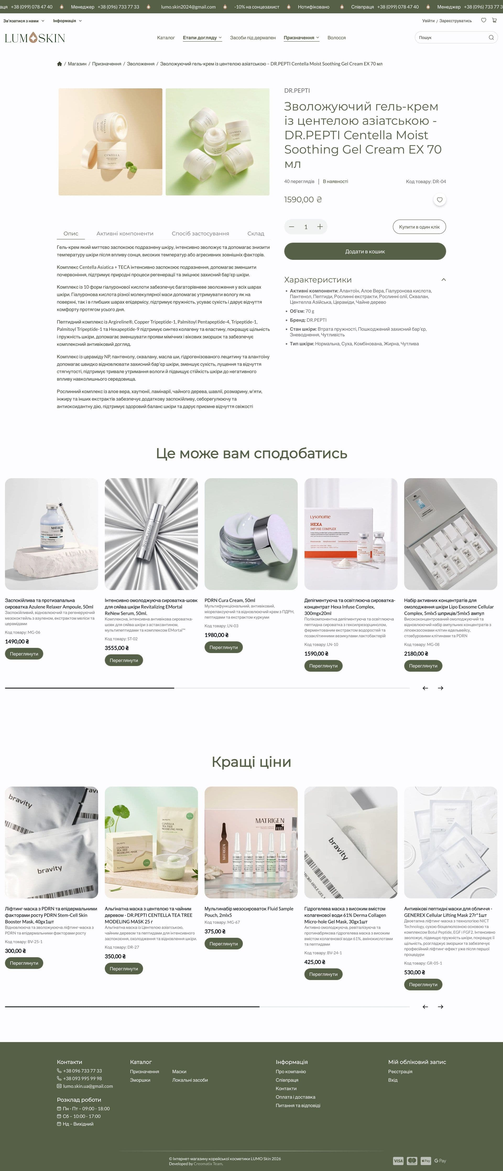
The product card gathers everything needed for a decision: photos, brand, code and availability, price, quantity and the “Add to cart” and “Buy in one click” buttons. Below are tabs for “Description”, “Active ingredients”, “How to use” and “Composition”, and on the right a short table of characteristics: active ingredients, volume, brand, skin condition and skin type. The same parameters work as filters in the catalog, so shoppers choose a product by what their skin needs rather than by name.
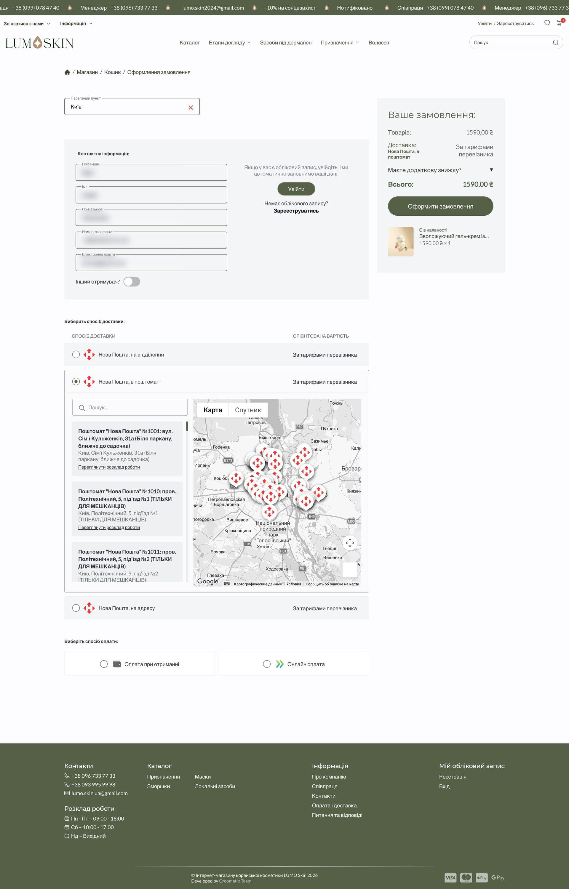
Checkout fits on a single screen: city, contact details (you can sign in so the form fills itself), an “Another recipient” switch, a choice of Nova Poshta delivery to a branch or a parcel locker with search and a map of points, and an order summary with a discount field.
After launch we keep supporting the store: updating the catalog, adding new brands and promotions, and keeping an eye on performance.
Technologies
- WordPress
- WooCommerce
- PHP
- MySQL
- JavaScript
- SCSS
- Swiper
- REST API
- Rank Math SEO
What we built
- Catalog by care step and by product purpose
- Filters by active ingredients, brand, volume, skin condition and skin type
- Product card with tabs: description, active ingredients, how to use, composition
- “Add to cart” and “Buy in one click” buttons
- “You may also like” and “Best prices” blocks
- Wishlist, cart and single-screen checkout
- Nova Poshta delivery to a branch or parcel locker with a map
- Personal account with registration and order history
- Brands, customer reviews and FAQ on the home page
- Partnership page for partners and salons
- Promo bar and running line for promotions
- Responsive interface for smartphones and tablets
- Per-page SEO settings and structured data
What the client got
Instead of a crowded storefront, the client received a calm, clear store where the catalog answers the customer’s need rather than making them guess. The new version already runs on a staging environment and is being prepared for production on the main domain.