CPA Targetadw
CPA Targetadw is the design of a CPA network in which advertisers publish offers, and affiliates (webmasters and arbitrage teams) bring traffic and get paid for target actions. The task was to put three different roles into one product so that each sees only what it needs and finds the main numbers in seconds. This is a design project: the case shows the landing page, authorization and the dashboards, and all numbers and names on the screens are demonstration data.
What was done?
We started with the structure of the roles. An affiliate wants to find a profitable offer, get a link and see at once how much was earned. An advertiser needs to create an offer and control the budget and traffic quality. An administrator watches money, fraud and moderation. So each role got its own dashboard with a shared frame: a left navigation with groups of sections, search and notifications on top, a page title with a one-sentence explanation and a row of key indicators under it. When a person switches between roles, the interface does not have to be learned again.
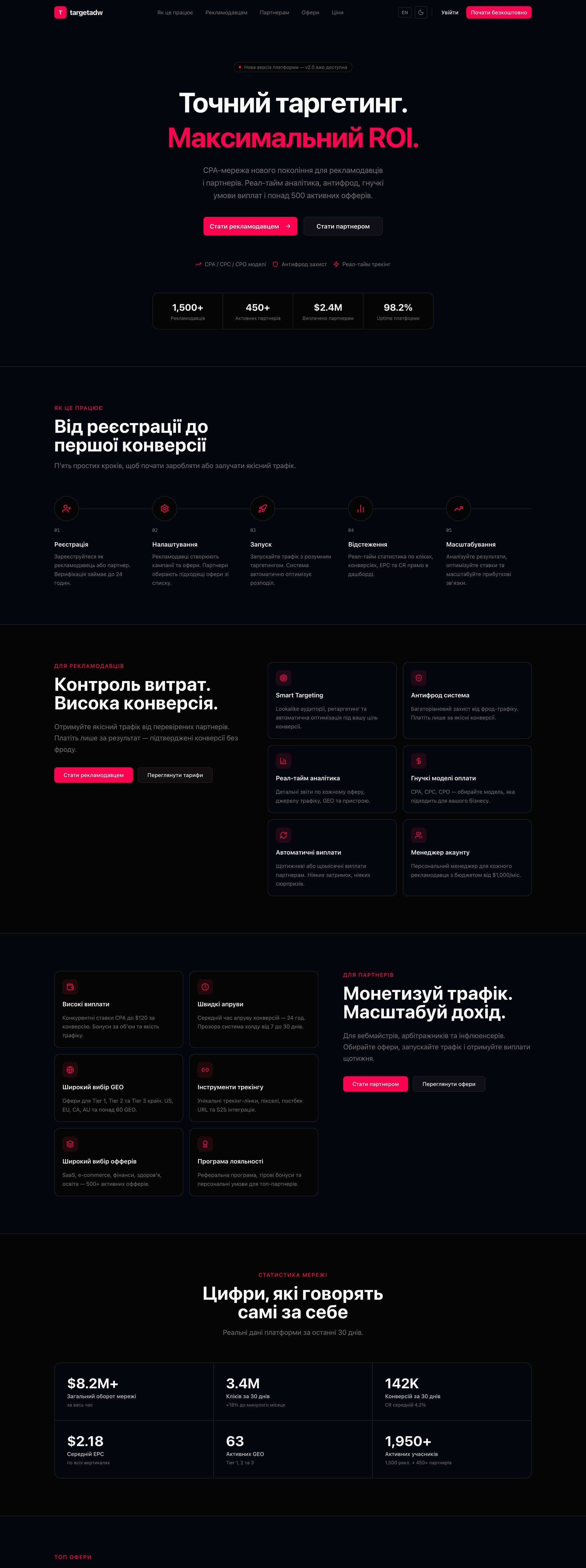
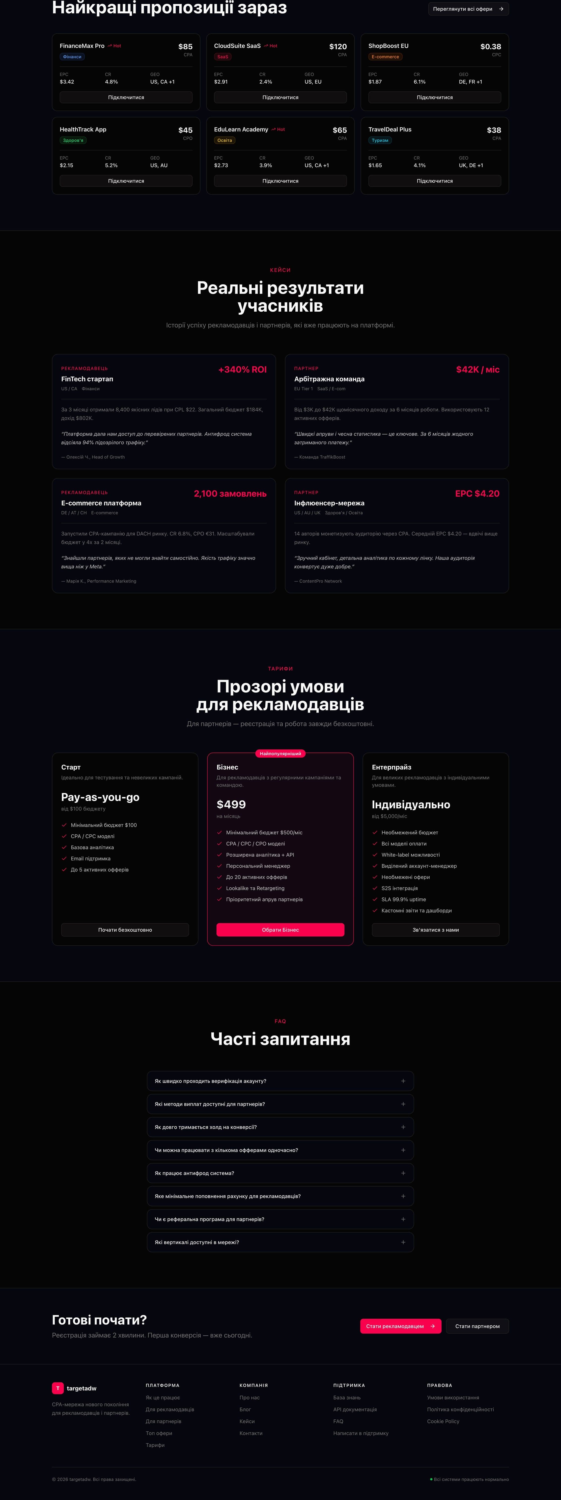
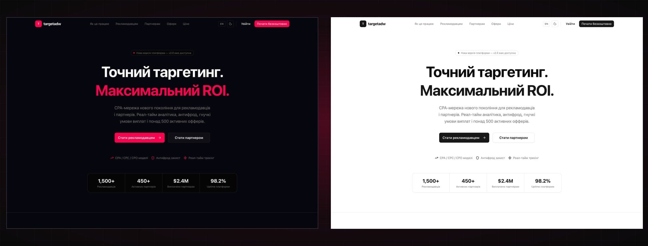
The landing page states its promise at once: “Precise targeting. Maximum ROI.” Under the title there are two buttons for two audiences (“Become an advertiser” and “Become a partner”), three short arguments (CPA/CPC/CPO models, anti-fraud, real-time tracking) and a block of trust figures. Then come five steps from sign-up to the first conversion, separate blocks for advertisers and partners, network statistics, a selection of the best offers, participant stories, three pricing plans with “Business” highlighted, questions and answers and a final call to action. The landing page comes in dark and light themes: in the dark one the accent is pink-red, in the light one it is replaced by black, and the theme and language switches sit in the header.
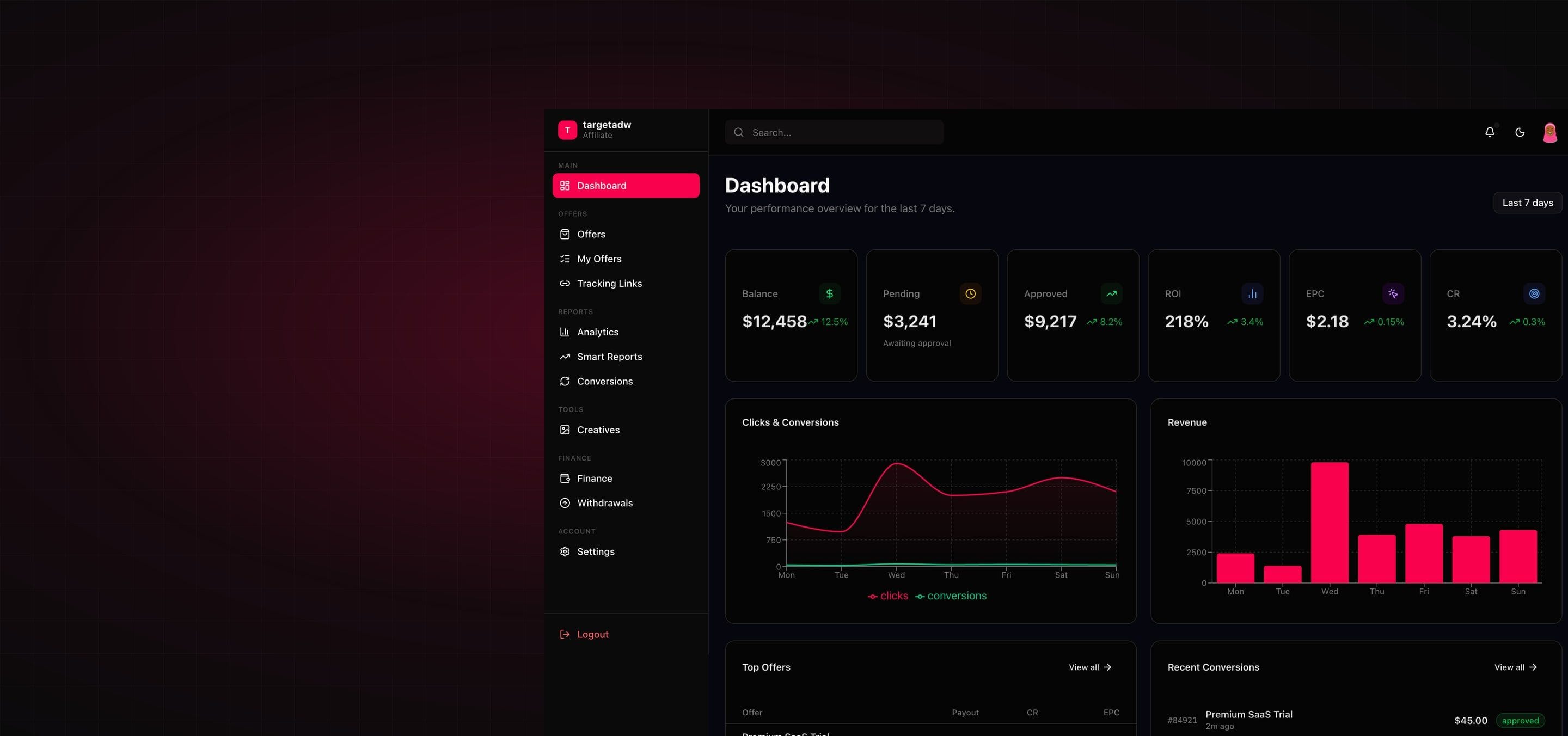
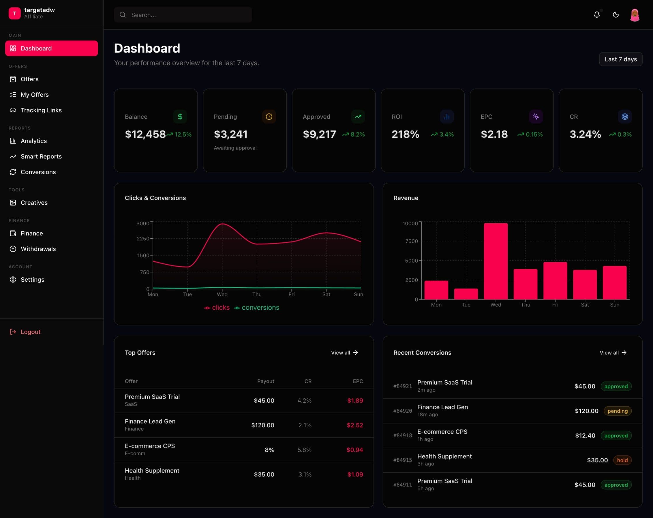
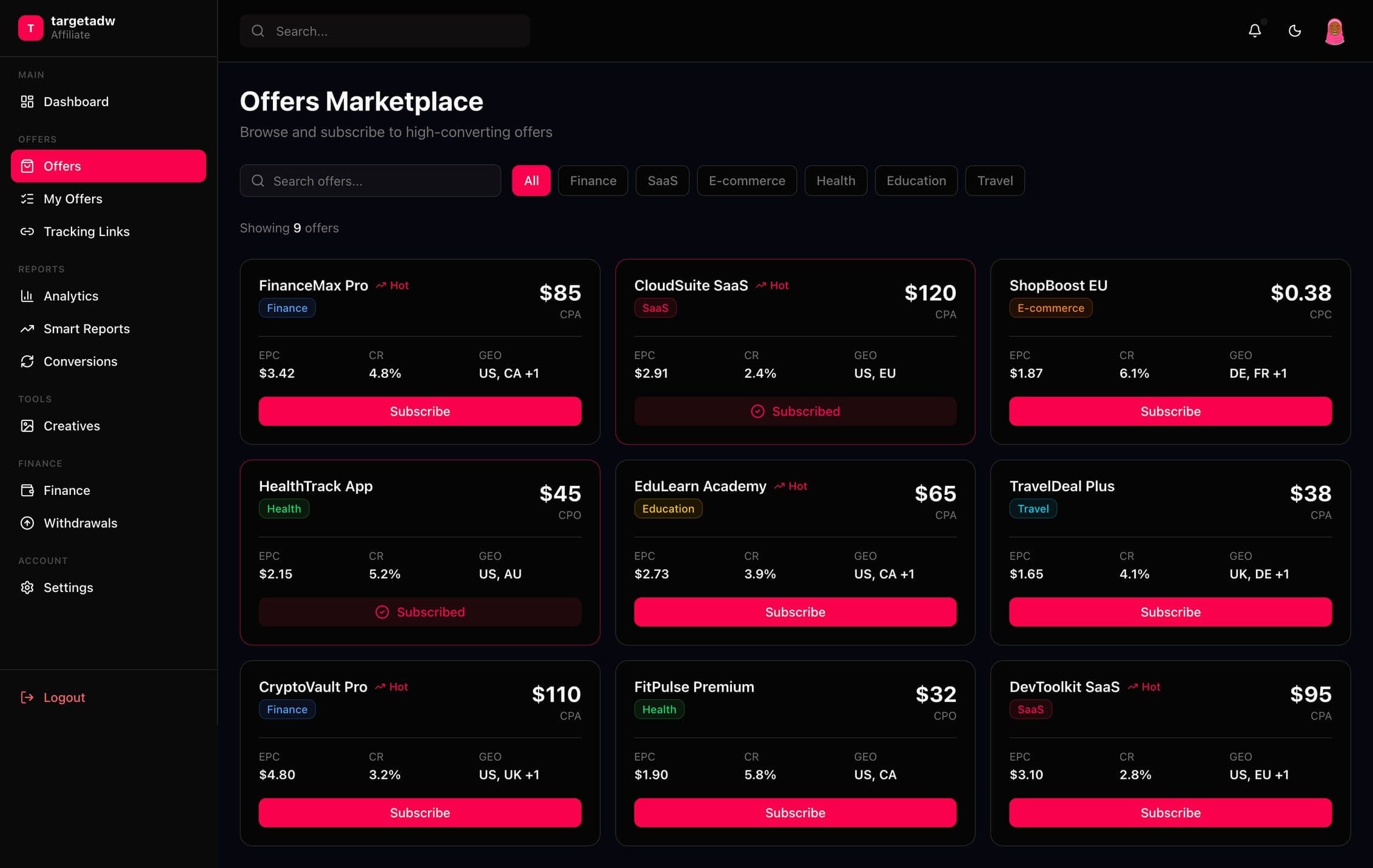
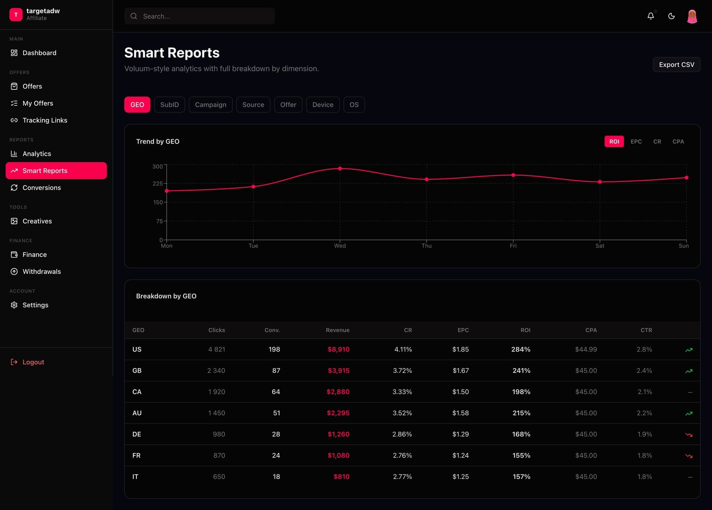
The affiliate dashboard is built around three questions: what to take, where to send traffic and what was earned. The dashboard shows six indicators (balance, pending, approved, ROI, EPC, CR) with their dynamics, charts of clicks and conversions and of revenue for the week, top offers and recent conversions with statuses. The offer marketplace is made of cards with payout, EPC, CR and GEO, has search and a filter by vertical (finance, SaaS, e-commerce, health, education, travel) and a “Hot” mark for the hottest offers. Smart Reports let you group statistics by GEO, SubID, campaign, source, offer, device and OS, switch metrics (ROI, EPC, CR, CPA) and read a breakdown table. There are separate sections for tracking links with copying, analytics, conversions, a wallet and withdrawal requests.
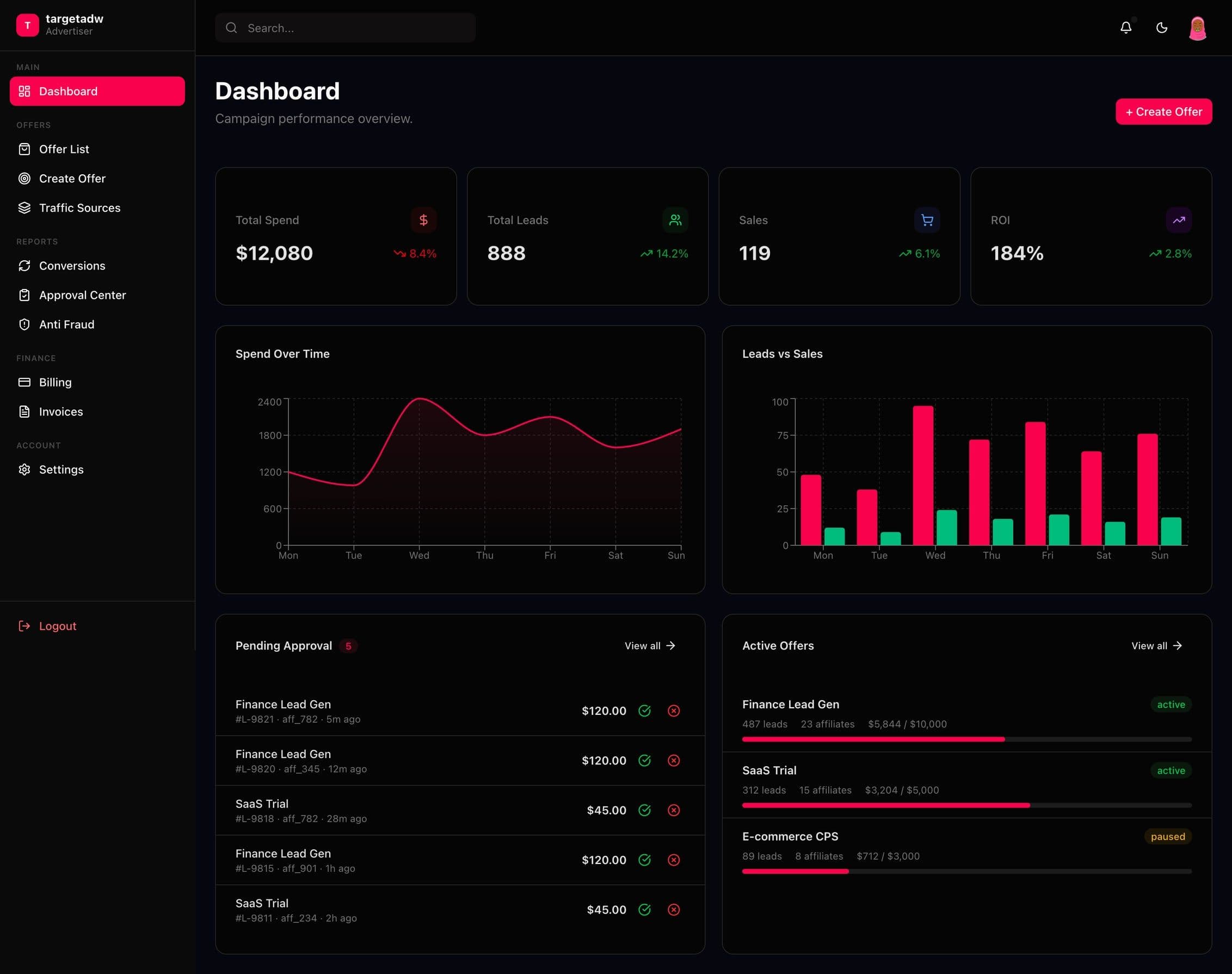
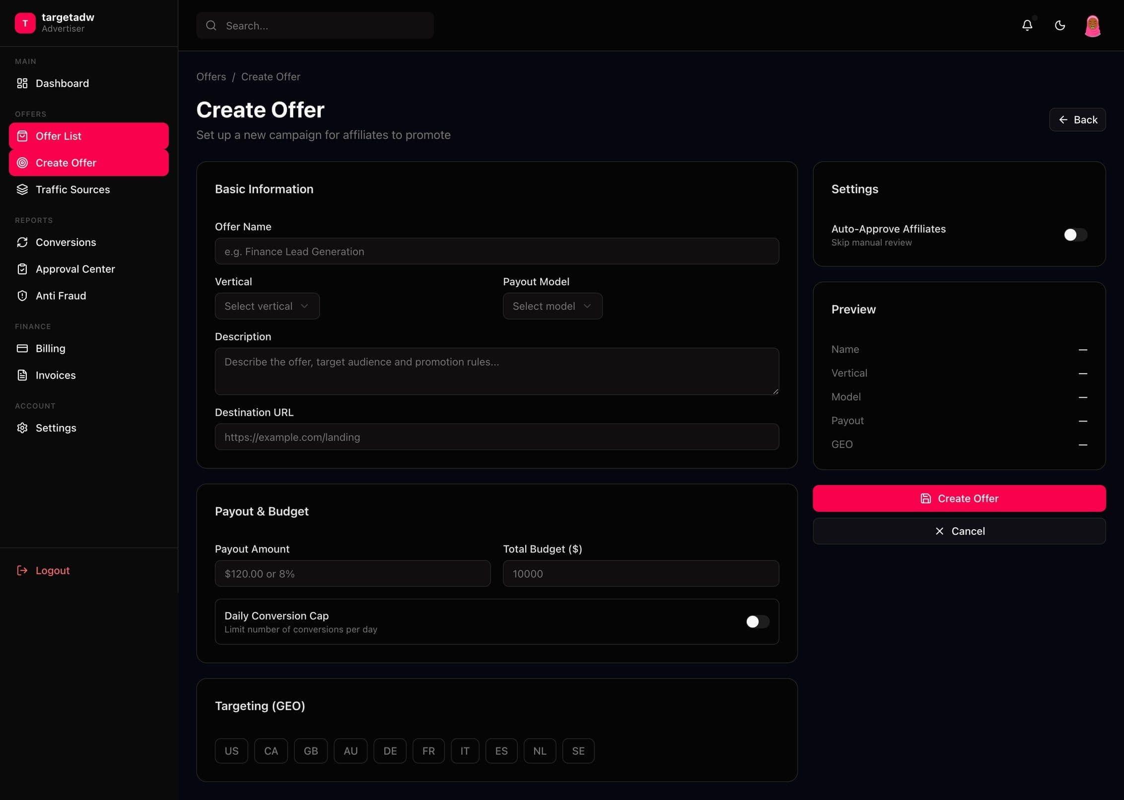
The advertiser dashboard answers how much was spent and what it brought. The dashboard shows spend, leads, sales and ROI, charts of spend and of leads with sales, leads pending approval and active offers with budget progress. Offer creation is one form with basic information, payout and budget, settings (auto-approve, a daily cap of conversions) and a live preview on the right so that the result is visible at once. There is an offer list, an approval center for leads with actions right in the row, traffic sources with a breakdown by channel and GEO, anti-fraud, billing and invoices.
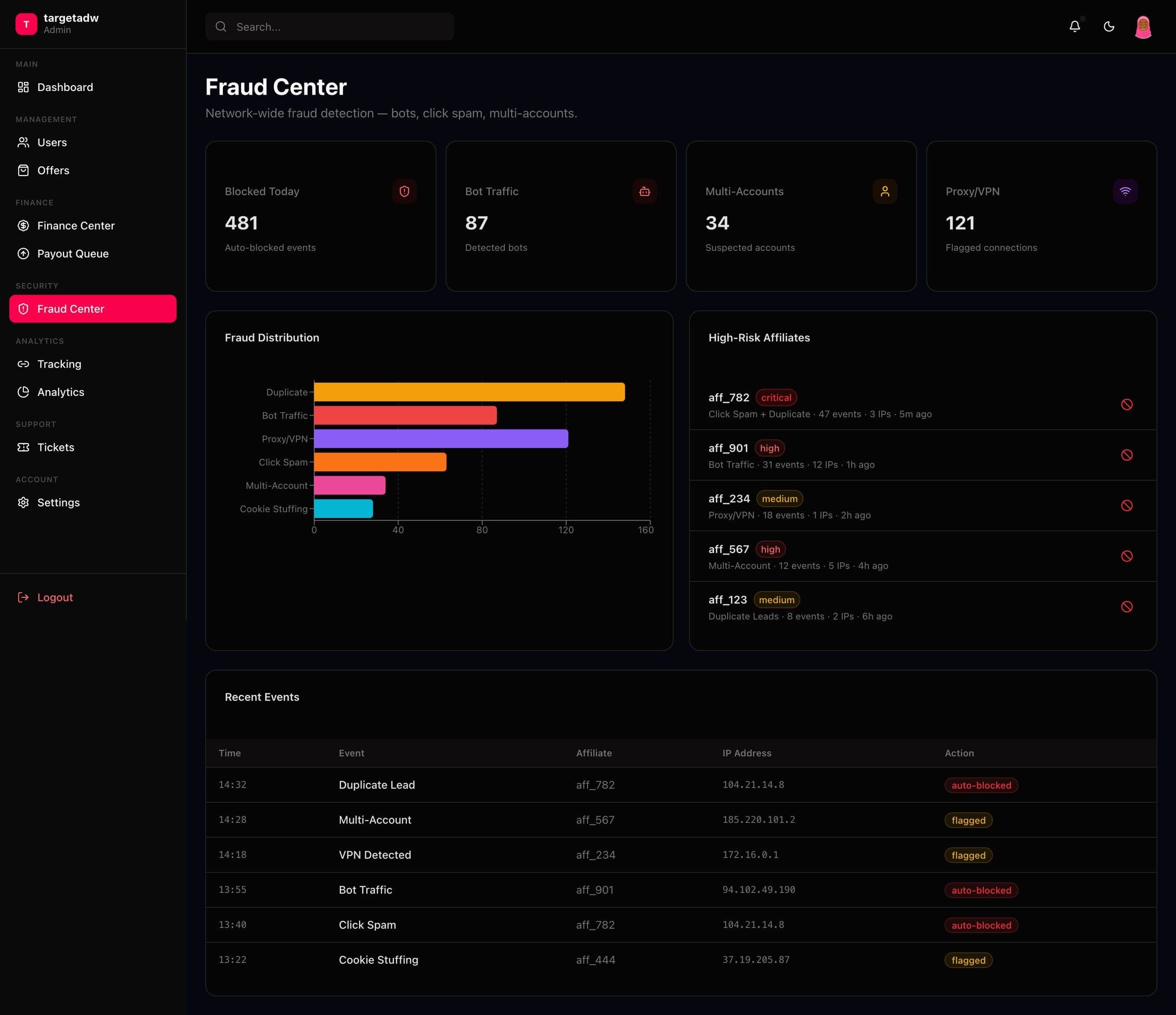
The administrator dashboard focuses on control. The network dashboard shows turnover, active users, active offers and blocked fraud, plus new registrations and payouts under review. The finance center gathers deposits, withdrawals and holds in one place with a payout queue. The fraud center shows the distribution of violation types (duplicates, bots, proxy/VPN, click spam, cookie stuffing), high-risk affiliates and a table of recent events. Offer moderation has statuses and quick actions.
The visual language is simple: a dark base, one expressive pink-red accent for main actions, the active section and charts, cards with thin borders and large numbers for indicators. Statuses keep stable colors across all dashboards: green for approved, amber for pending, orange for hold, red for declined. One icon set and shared components (indicator cards, tables, filter chips, switches) keep the screens in one language. The dashboards are in English and the landing page is in Ukrainian.
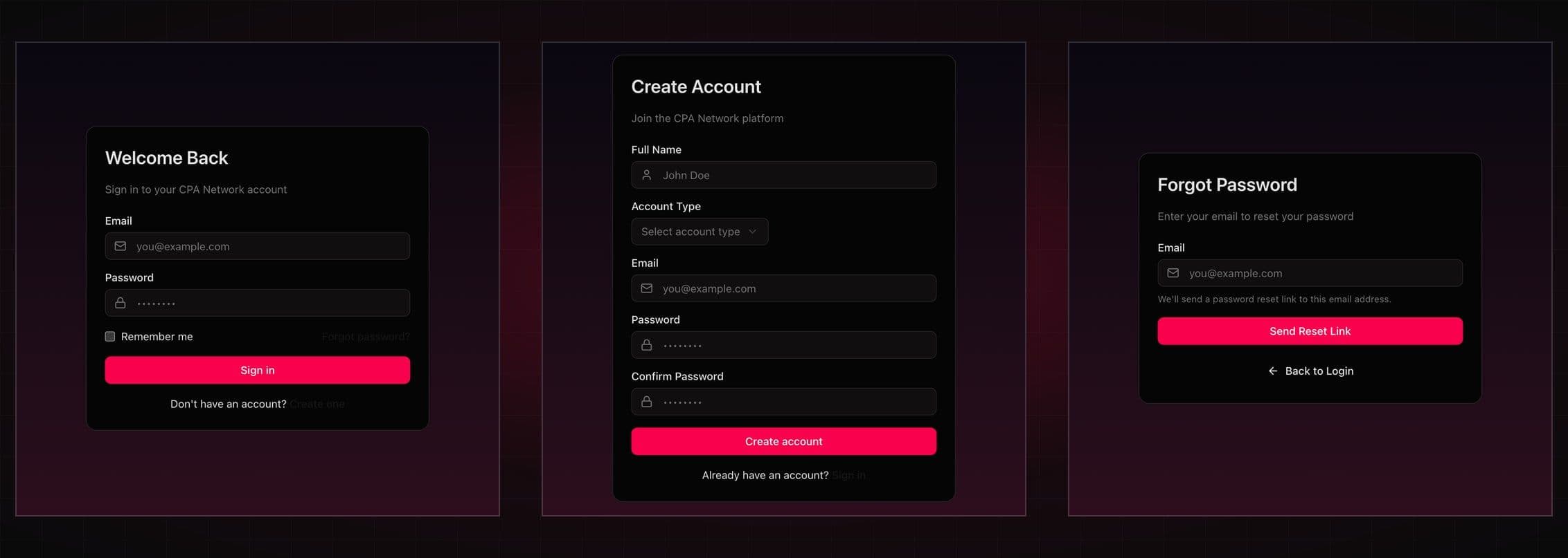
All in all there are more than 25 screens: the landing page in two themes, sign-in, sign-up and password recovery pages and about twenty screens of the three dashboards. The case shows the most important ones.
Technologies
- Design system and UI kit
- Screen and state layouts
- Dark and light themes
- Icon library
- Chart and table components
What we built
- A landing page in dark and light themes with a language switch
- Sign-up with an account type choice, sign-in and password recovery
- Affiliate dashboard: overview, offer marketplace, my offers, tracking links
- Smart Reports grouped by GEO, SubID, campaign, source, device and OS
- Analytics, conversions with statuses, a wallet and withdrawals
- Advertiser dashboard: overview, offer creation with a live preview, a lead approval center
- Traffic sources, anti-fraud, billing and invoices
- Administrator dashboard: network overview, finance center, offer moderation
- A fraud center with violation types and high-risk affiliates
- One system of statuses, indicator cards, tables and filters
What the client got
The client received a coherent design of a CPA network: a landing page in dark and light themes, authorization and screens for three roles with one design system. This is a design project, so the case shows exactly that.