User Behavior Has Changed: Mobile First, Impatience and Blindness to Standard Patterns
Today people scan a page in seconds, most often on a phone and between other things. What it means for a site: mobile experience, popup fatigue, trust and cognitive load.
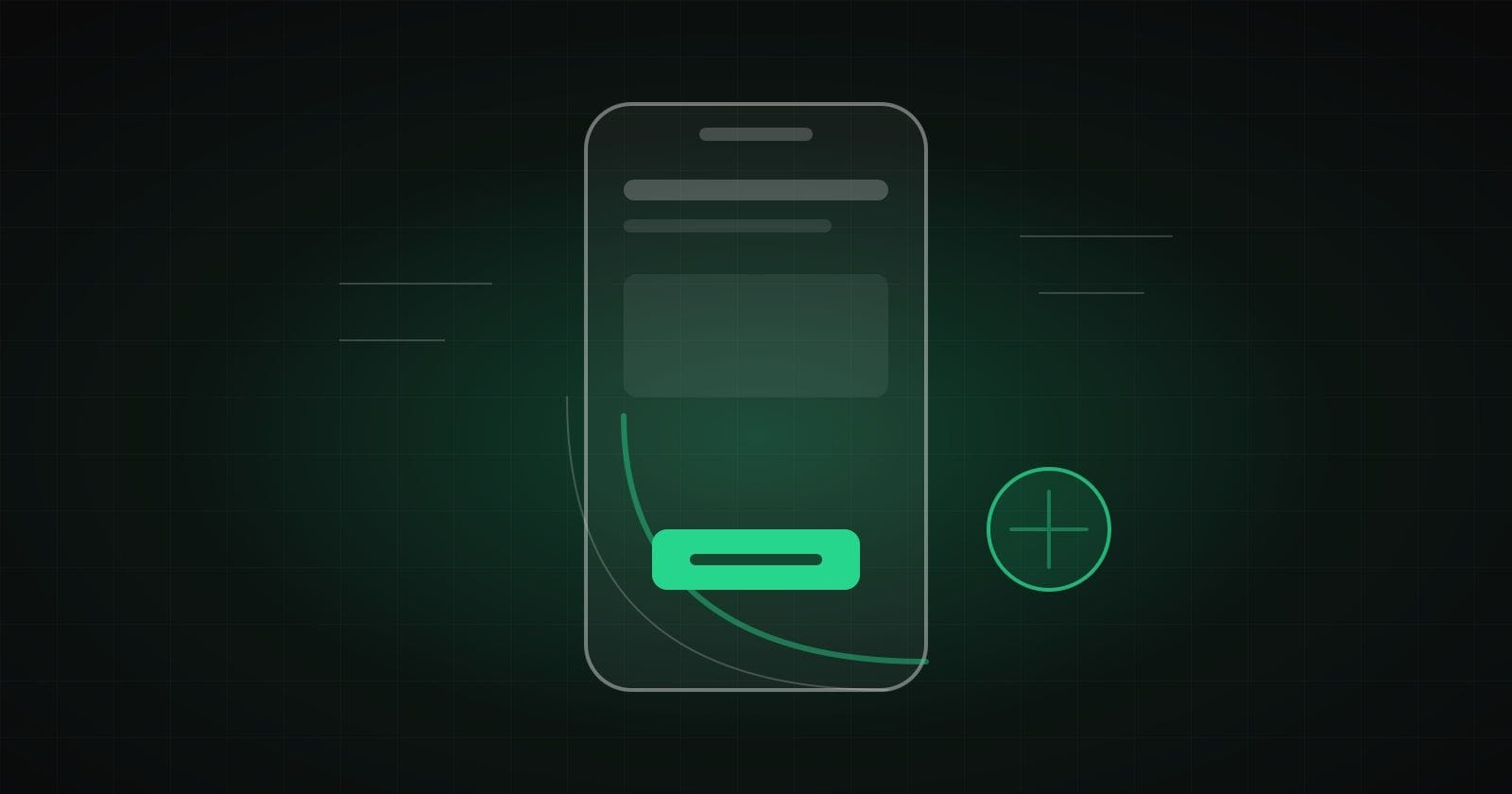
A few years ago we designed sites for a monitor first and then adapted them to a phone. Today in most projects the order is reversed: a person opens a page on a phone in a queue, on public transport or between two calls. They do not plan to read. They plan to understand in a few seconds whether this is what they need.
The phone as the main device
A mobile version should not be a shrunken copy of the desktop one. During an audit we check several things that are easy to miss:
- The thumb zone. Main buttons should be where the thumb of one hand reaches, not under a header in the top corner.
- Target size. Links placed tightly next to each other cause accidental taps. It is more irritating than it seems.
- Speed. On mobile internet every extra second of loading takes visitors away before the first screen. We cover this in more detail in our Core Web Vitals article.
- Readability. Short paragraphs, clear headings, a comfortable font size. No fighting with zoom.
A simple rule: open your form on a phone and try to fill it in with one hand, standing. If it takes effort, your customers feel it too.
Banner blindness and fatigue from the aggressive
People have learned to ignore everything that looks like advertising. It works even when a block contains useful information: if it looks like a banner, it is skipped.
On top of this blindness comes fatigue from pushy elements:
- a popup that jumps out a second after the page opens;
- a chat that opens by itself and asks "how can I help you?";
- five-step forms that make you enter everything again if something went wrong;
- a cookie banner that takes up half the screen.
Each of them looks like a small thing on its own. Together they create a feeling that the site stands between a person and what they need. The answer is not to remove everything but to show the right thing at the right time: a chat after the person has scrolled to the prices, not in the first second.
Trust: what removes the fear of acting
Before leaving contact details or paying for an order, a person silently goes through an internal checklist. It is not always a conscious check, but it happens almost every time.
- Are the terms clear? Deadlines, stages, what the price includes.
- Are there any surprises? A price visible from the start, not only on the last step.
- Are there real people? Contacts, names, case studies and reviews that can be checked.
- What happens next? How soon you will get an answer, whether spam will start, whether you can opt out.
A good technique is to put one sentence next to the action button that removes the main fear. For example: "We reply within a working day. No obligations". It is a small thing that often matters more than a new color palette.
Why a CRO audit is not "moving a button"
A button is only the tip of the iceberg. The real work is reducing cognitive load: the number of decisions a person has to make to reach the goal.
During an audit we look at a page as a sequence of questions a visitor is looking for answers to: "Is this about me?", "How much does it cost?", "Can I trust them?", "What should I do now?". If a question has no answer or the answer is confusing, the person leaves. Sometimes the fix is a new paragraph, sometimes a different page structure and sometimes removing what got in the way.
What to check this week
- Walk through your main scenario on a phone, in two different browsers.
- Count how many elements on the first screen compete for attention.
- See whether the page answers questions about price, timing and what happens after a request.
- Remove at least one extra step or field in a form.
If you want to see your site through a new user's eyes, we can help with the audit and the design of changes in the UI/UX design direction. And for a broader look at site mistakes, see our UX audit checklist.
How we help with this
Services related to the topic of this article:
Frequently asked questions
What is banner blindness?
It is the habit of not noticing blocks that look like ads. People skip them even when there is useful information inside. So an important message is better built into the content itself than made to look like a banner.
Can a site show a popup?
It can, if it appears at the right moment: after a user action or on exit, does not cover the content on a phone and is easy to close. A popup that jumps out right after the page opens usually annoys people.
How many fields should a form have?
Exactly as many as needed to start a conversation. Everything else can be clarified later. An extra field almost always lowers the number of submitted forms.
Read next
 UX/UI design
CRO as an Ongoing Process, Not a One-Time Pill
One audit gives a quick push, but the market and audience habits keep changing. How to build a hypothesis backlog, avoid mistakes when reading test results and combine numbers with the voice of users.Read → UX/UI design
Expensive Traffic Does Not Forgive Funnel Leaks: Why CRO Matters More Than Another Ad Budget Increase
When a click gets pricier, every low-converting page costs more. Why a CRO audit often pays back more than a bigger ad budget and how to prove it to management before any tests run.Read → UX/UI design
Website UX Audit: 10 Checks Before a Redesign
Before drawing a new design, check the current site: a clear offer, navigation, mobile version, forms and trust. A ten-point checklist.Read →
Need advice on the topic?
Describe the task: we will suggest where to start and say honestly what you can skip.